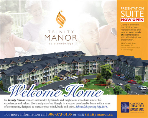
Trinity Manor at Stonebridge is a seniors' active living residence that was in the pre-construction planning phase when they came to us for some marketing support. It was a short timeline, low budget, shorthanded project but in the end one of my more satisfying ones. Once we settled on a name we were off to the races and, with the help of the sales materials we created, the project construction is nearing completion and space is nearly sold out.

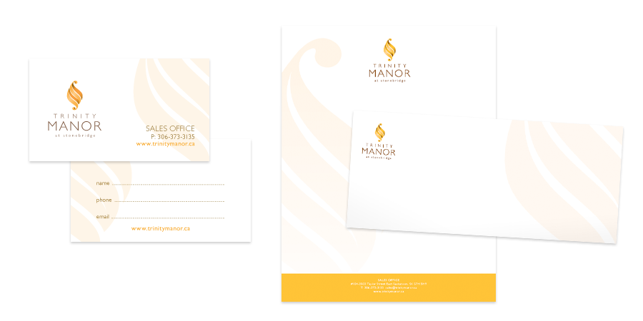
Trinity Manor is Catholic owned, but is open to all applicants, so we wanted to retain undertones of Christianity but keep it welcoming and nonspecific. I think we were successful with a stylized "M" icon that evokes a candle flame with influences of traditional Holy Spirit imagery. Friendly but thoughtful, warm and inviting, the icon has been successfully incorporated into the residence itself in many forms and applications.
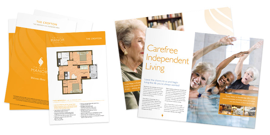
The marketing package featured a custom folder with dual pockets and overleaf, and contained a myriad of brochures and information sheets for prospetive buyers. For the initial run to supply an announcement event I in-house printed, hand-cut and assembled at least a dozen full packages. Thankfully a proper print run was done soon after!

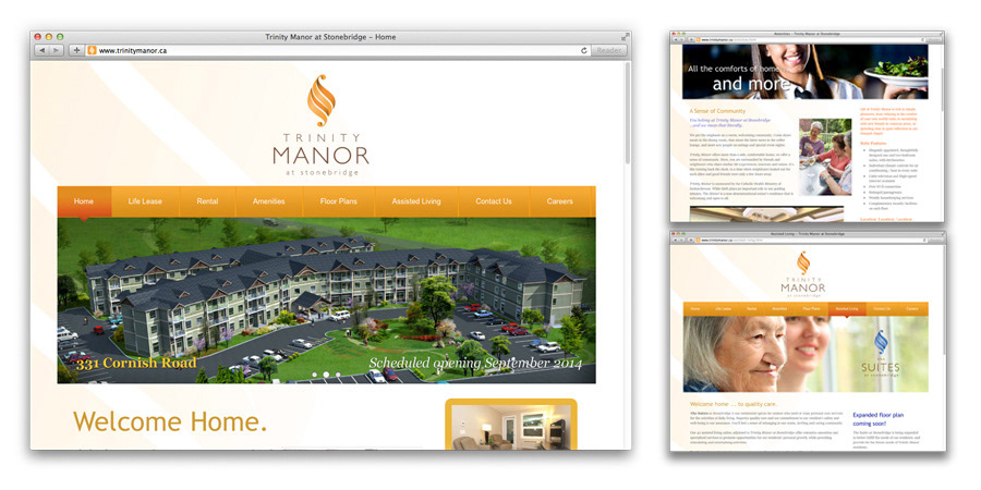
I also built a simple Weebly.com-powered website for the pre-construction phase, which can be viewed at trinitymanor.ca.
Advertising was limited, but several soft-launch style ads were placed in regional newspapers and church newsletters.