This is a website design that was done for the Wanuskewin Heritage Park in Saskatoon, SK. I'm going to show some comps first because the development was done by another company and the design got a little watered down in the process.
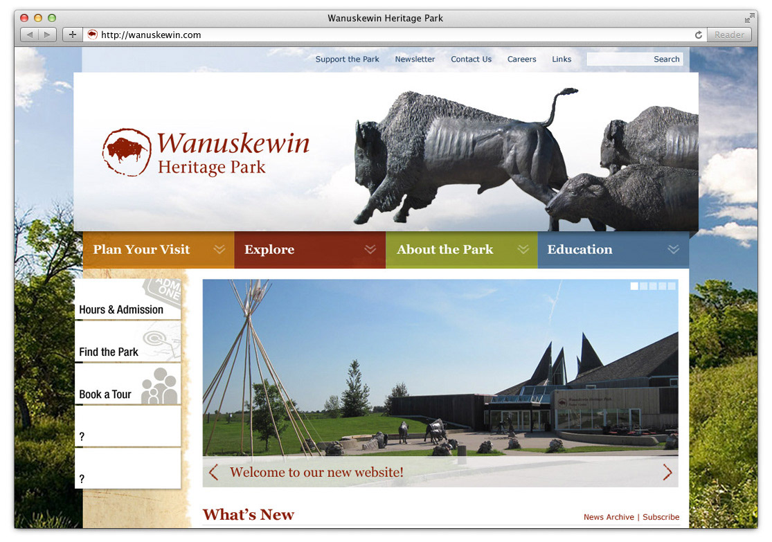
This was a proposed homepage design, with a sliding main menu that would push the content down on hover to reveal the colour-coded menu categories. The dominant white header space emphasized the park's branding by contrasting with the colourful background photo, and featured accent photos that showcased flora, fauna and museum pieces found at the site.
The concept was for the newest news stories to be pulled into the slideshow yahoo-style, and further news and events would be found in tiles below, along with mini-ads for programs and services.

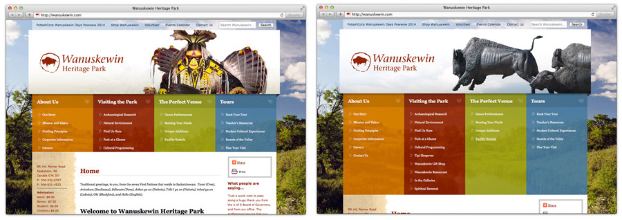
Below is a slightly earlier comp, which shows the expanded menu.

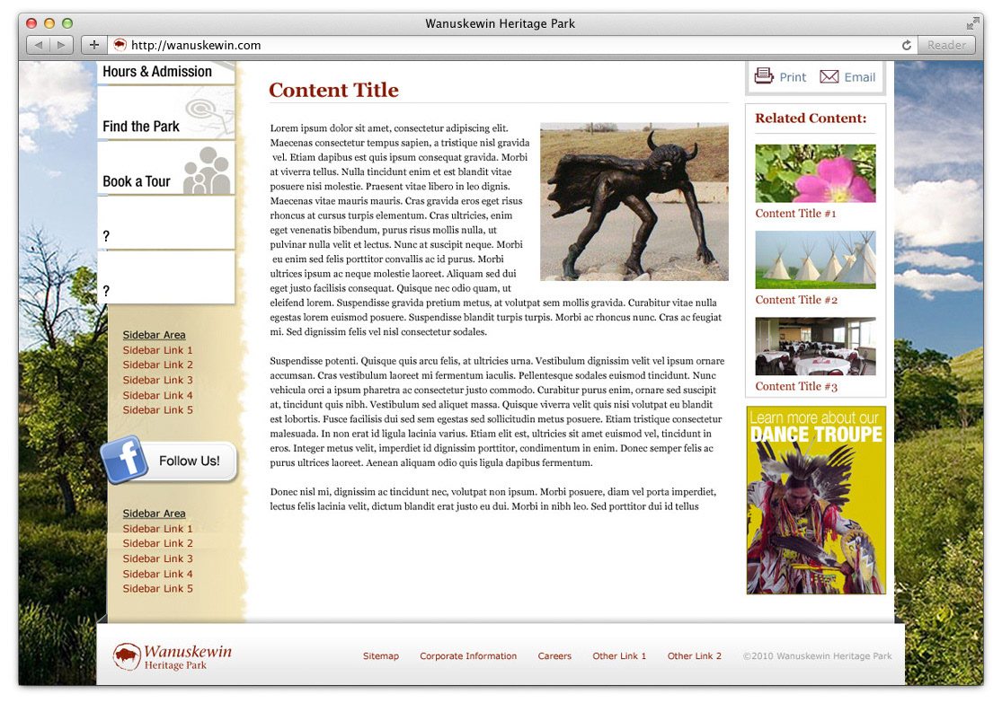
This is a basic content page. At the time their content was mainly text-based, and we counselled that they needed to gather a lot more visuals to make the content come alive, and I believe they've made some small strides since. We planned to include links to related content in the right sidebar, as well as internal mini-ads.
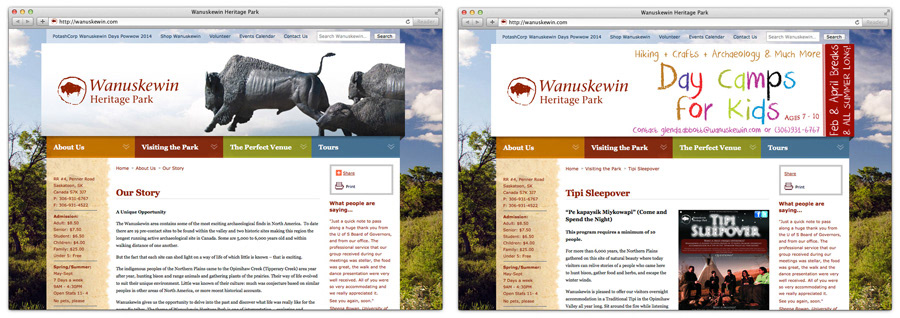
Here are some screencaps of the live site. It's actually not too bad, mainly just a little sparse outside of the feature header. The left-hand sidebar has been really cluttered up with info and links, and on some pages the header has been reappropriated as a billboard space, which wasn't in the original plan and could probably be handled better if at all.
I'd love a crack at updating this thing, and help them flesh out the content. It's a great facility and this is still leaps and bounds above what they had before this version was done, but it could be so much better.