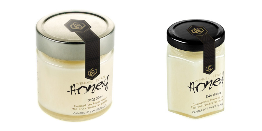
Wendell Estate Honey started out as a unique creamed honey straight from the hive that the Wendell family would produce in small batches and selfishly keep to themselves. The burgeoning high-end honey market spurred them to increase production and get it out in to the honey-hungry world.
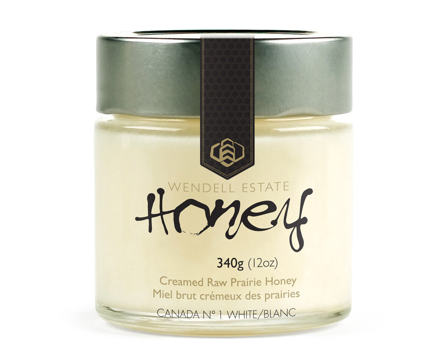
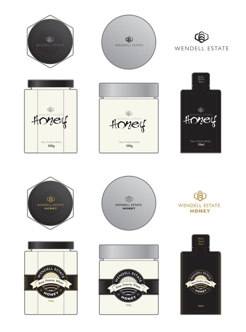
We helped them select a name and packaging solution, and I designed the logo and label, with freshness-guaranteed security sticker. If you look closely at the bee icon you can pick out a stylized "W" and "E", as well as a passing resemblence to grain elevators as a nod to their prairie roots.

This brochure was a fun little piece for their tradeshows and store shelves, with a honeycomb spot-gloss, gatefold inner spread, metallic gold ink for richness, and a corner nicked off for a bit of fun that implies a hexagonal shape that becomes more apparent as the brochure unfolds.

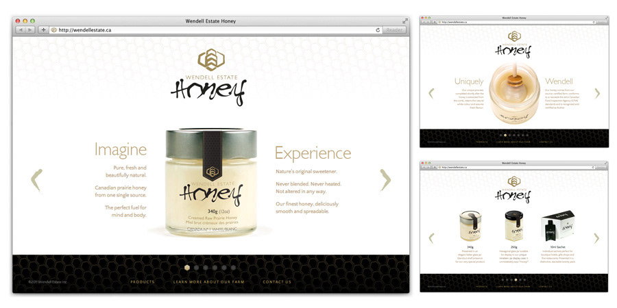
I built a simple one-page brochure website to get them off their feet and help promote their trade show circuit.
It has since been redesigned and fleshed out by another provider, but it keeps a lot of the same aesthetic.
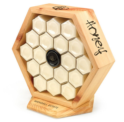
I wish I could take credit for the wooden display itself, but the Wendells were already building these on their farm for tabletop displays at trade shows. We can however take credit for convincing them that they were terrific and sprucing them up a bit with burned-in logos that can now be found on many a boutique retailer's shelf.

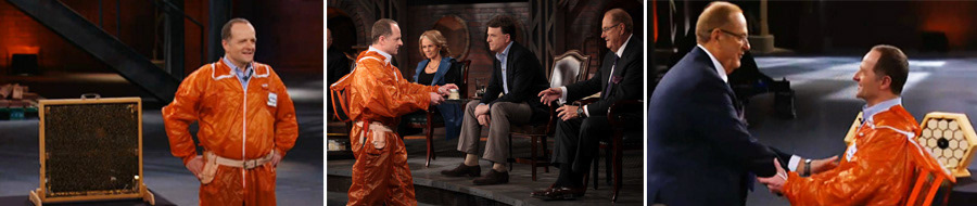
The Wendells followed up their work with us with a successful appearance on Dragons Den, where they garnered a deal with one of the less-sharky Dragons. Good job, Martin!
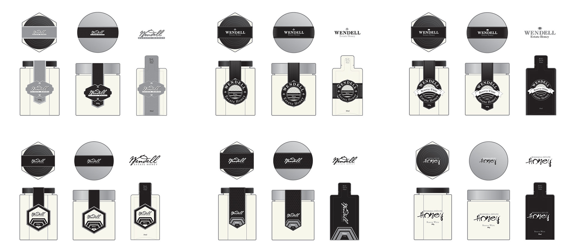
For a little background info, here are some early concepts that show the evolution towards the final branding.